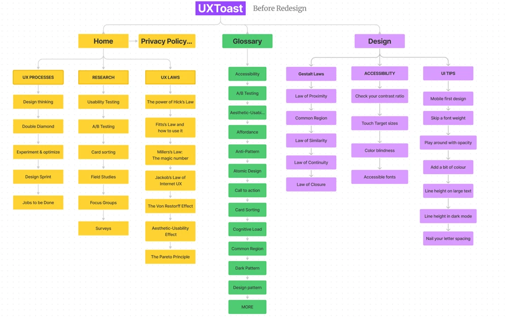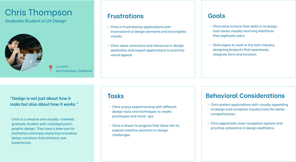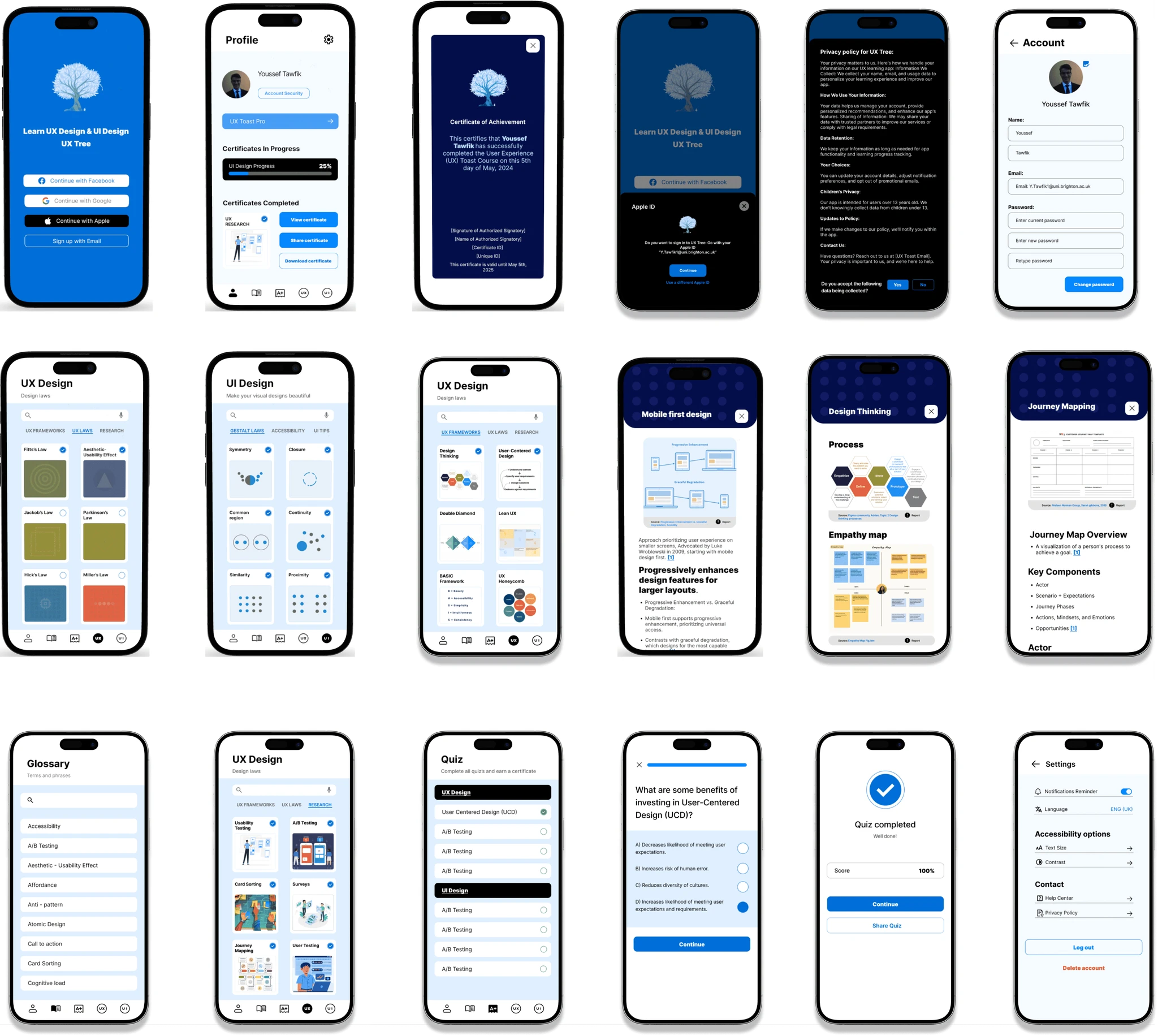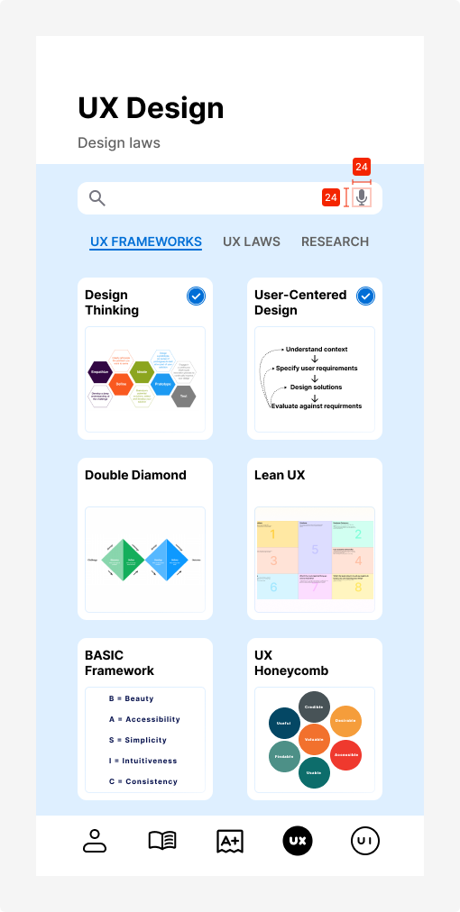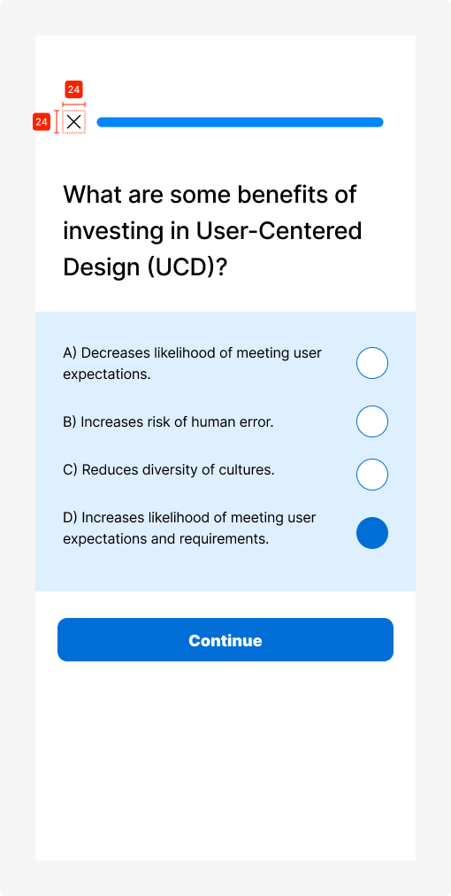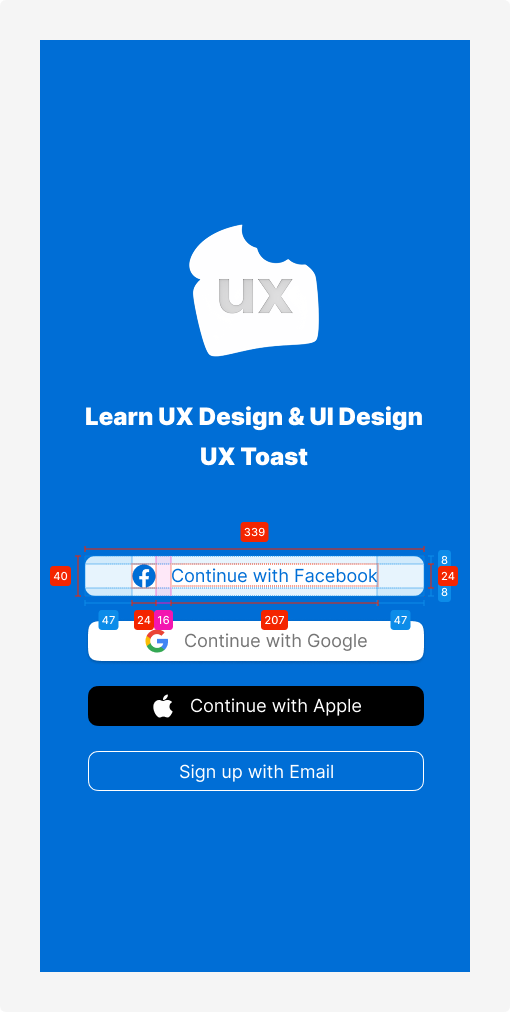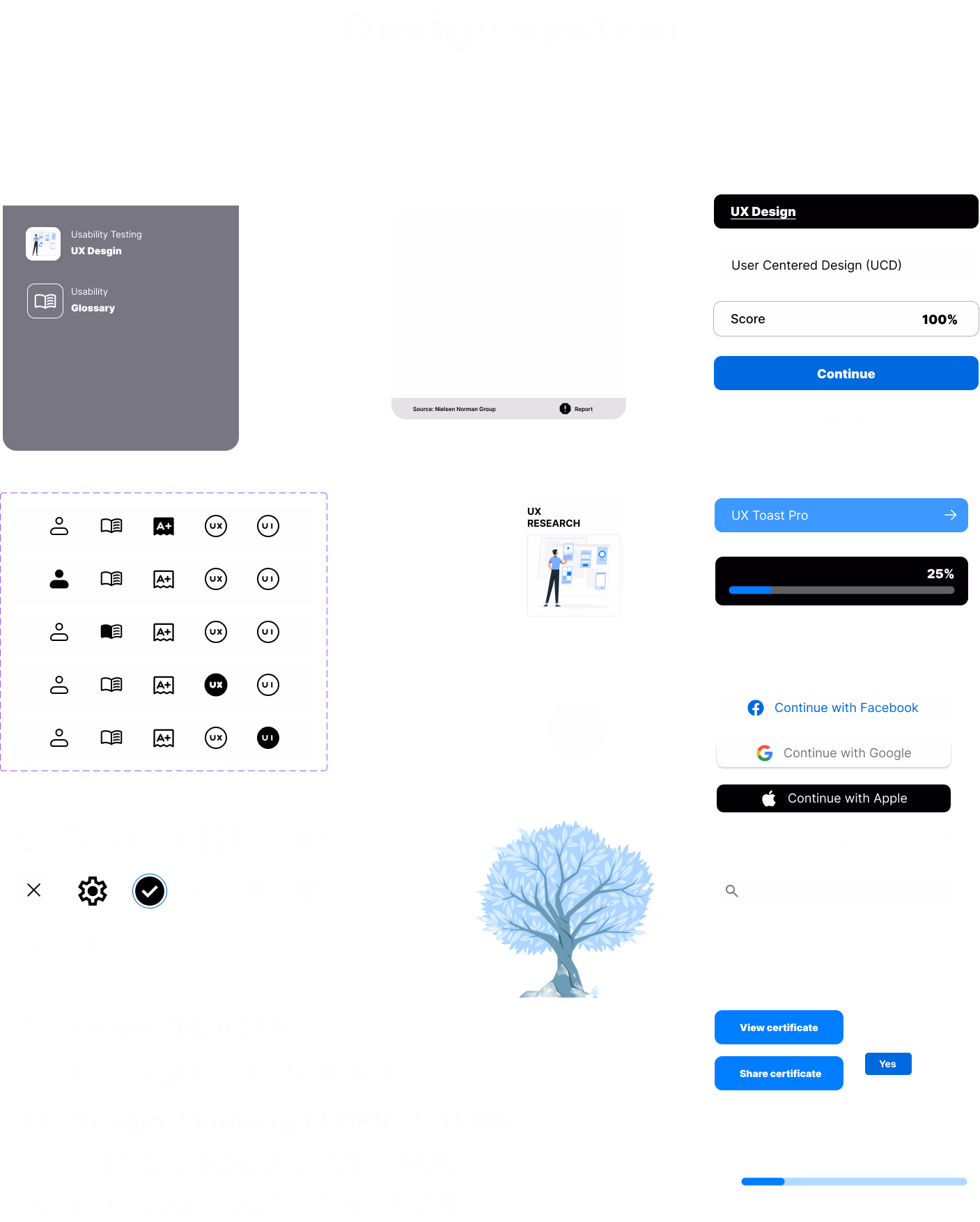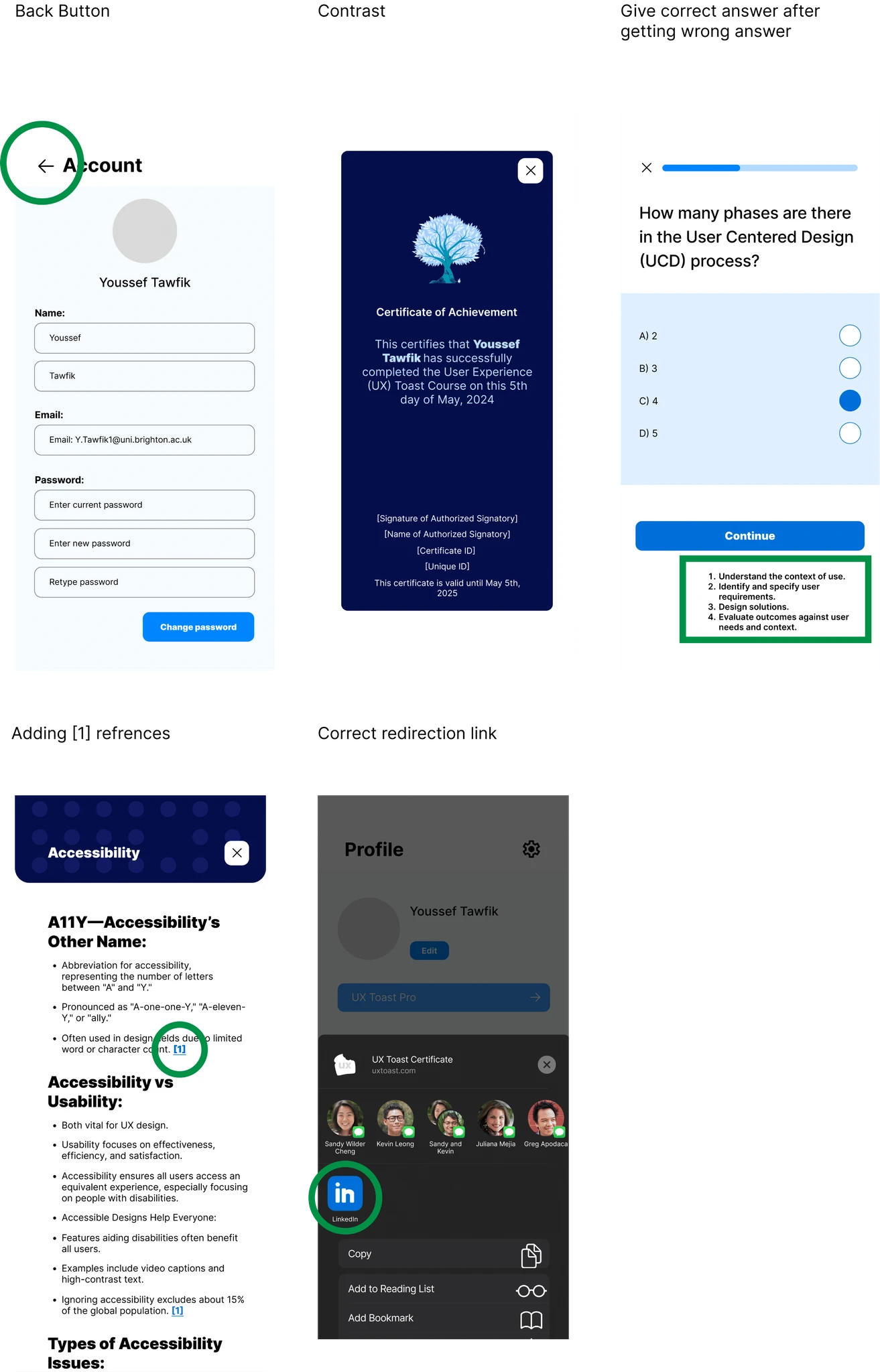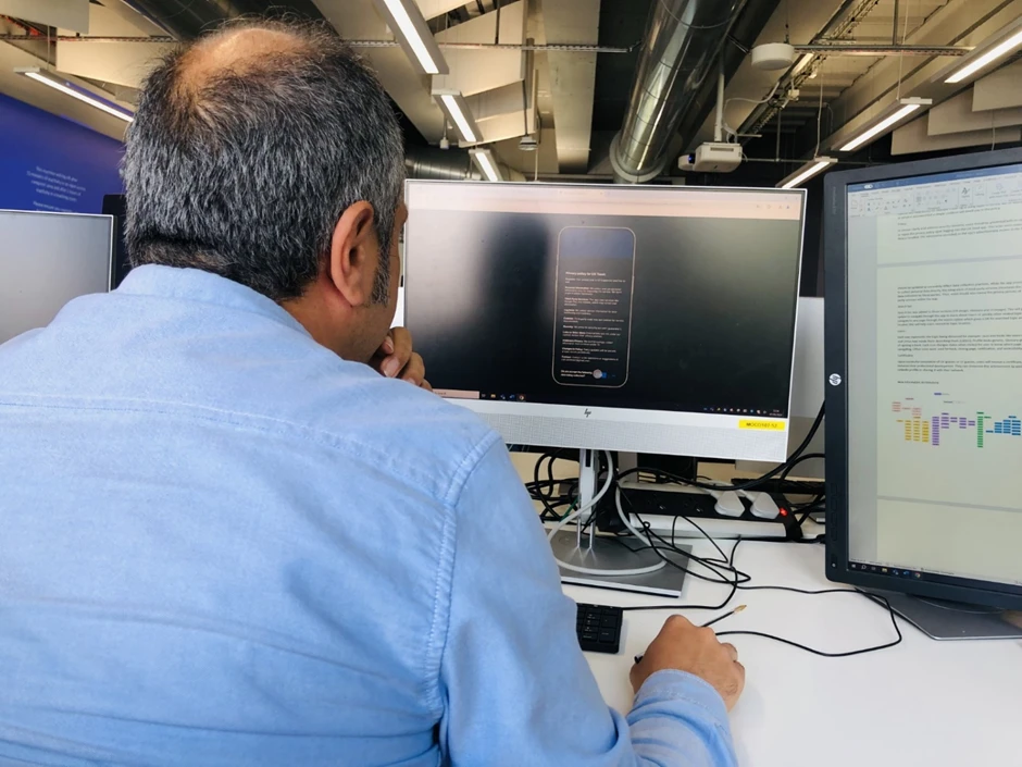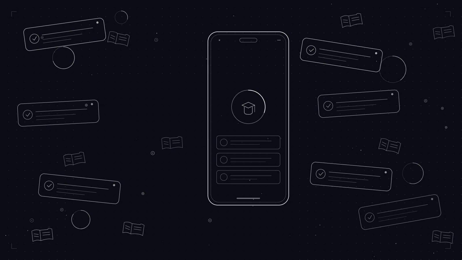
Mobile App Redesign
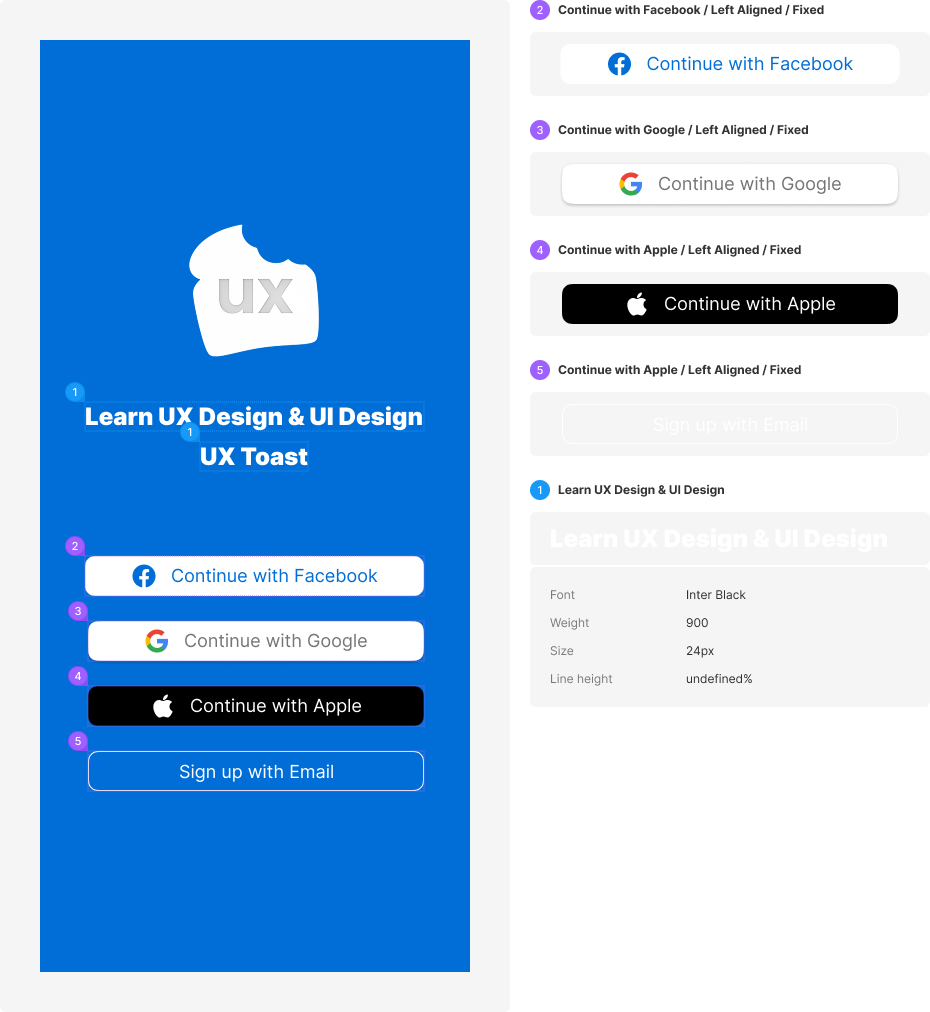
UX Toast Redesign
Transforming UX education through mobile learning - A comprehensive redesign of a UX learning application
Mobile App
Education
Redesign
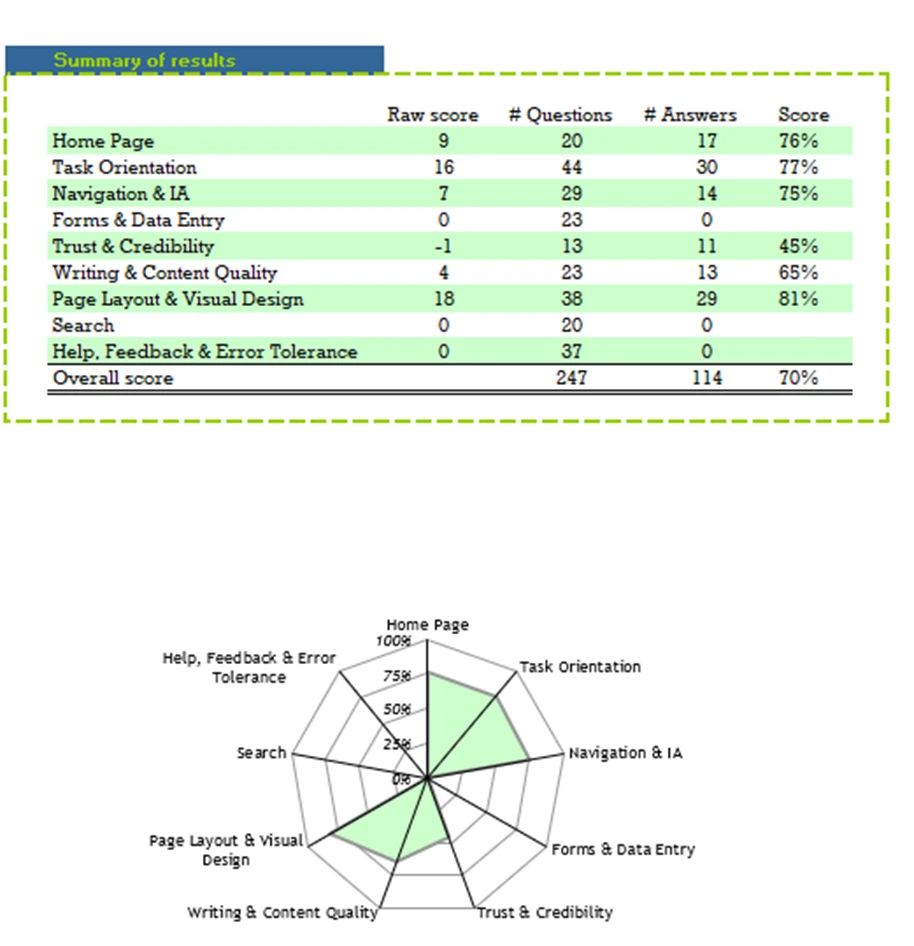
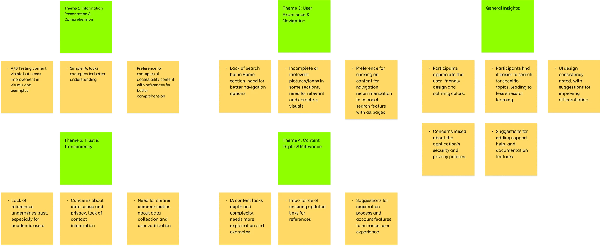
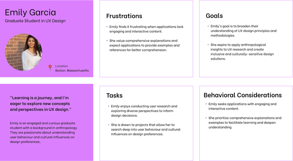
UX Research