AI-Powered Fitness App
🚧 In Progress
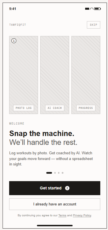
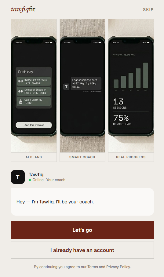
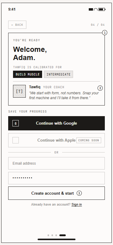
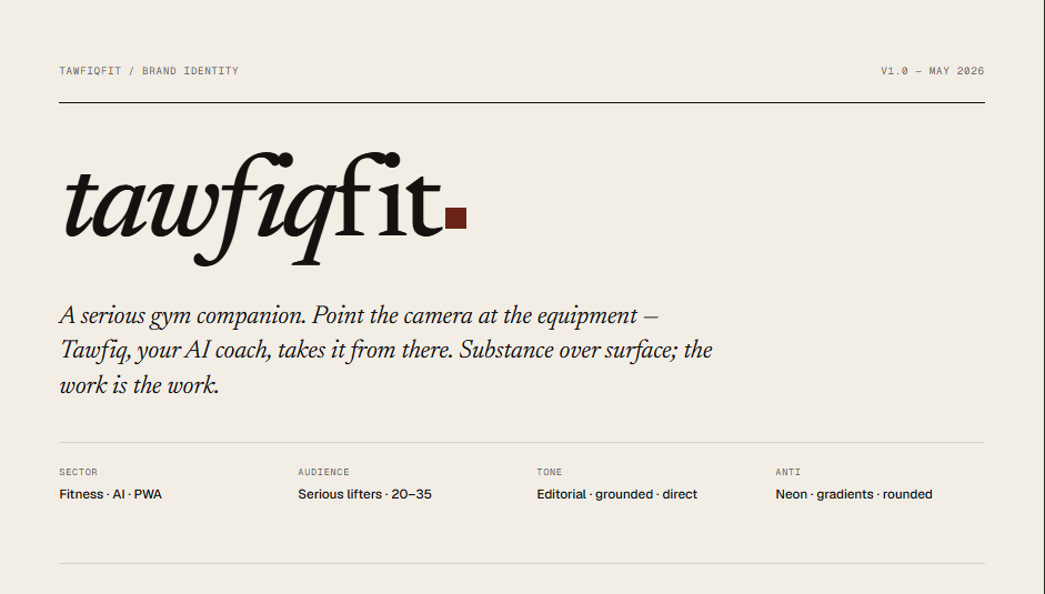
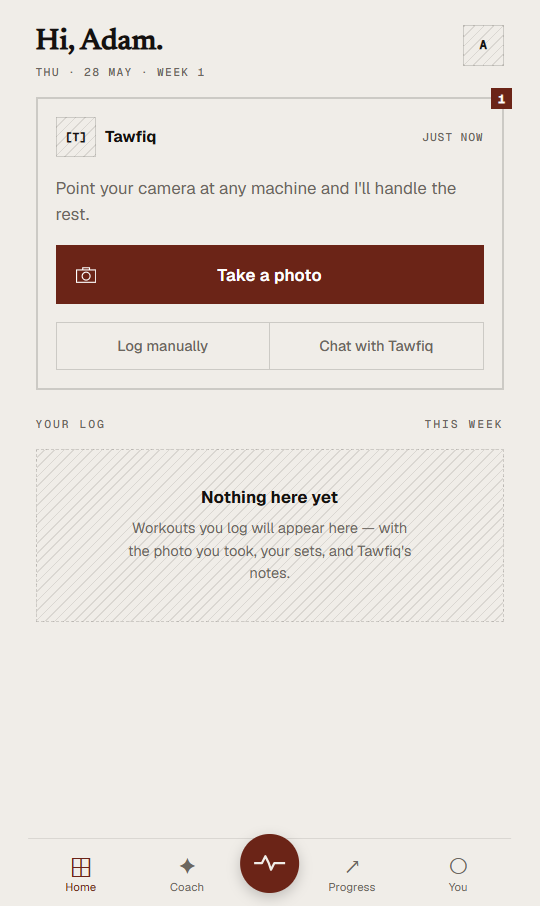
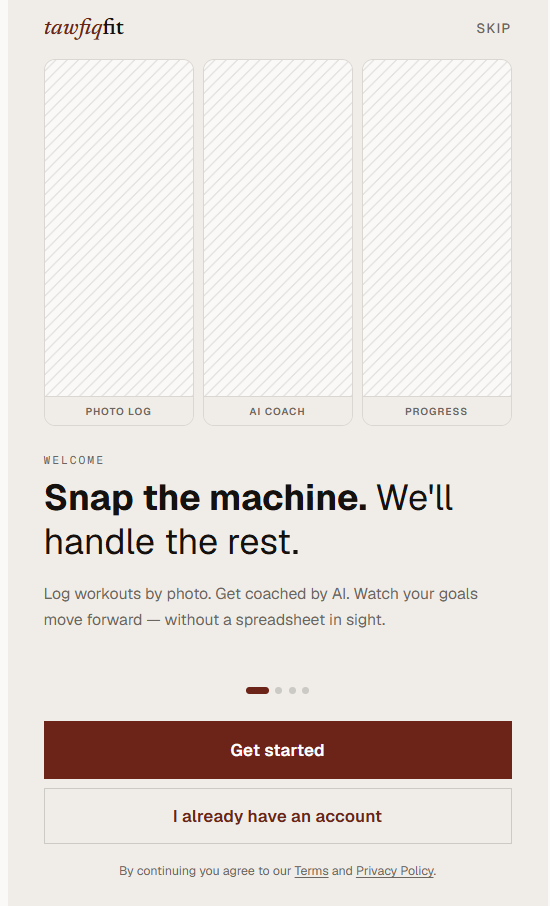
TawfiqFit
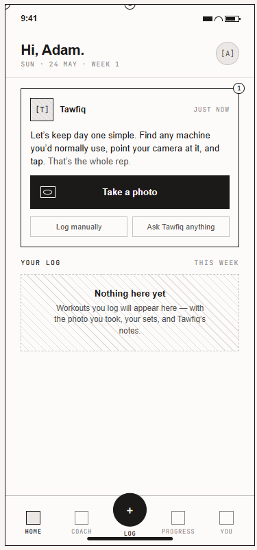
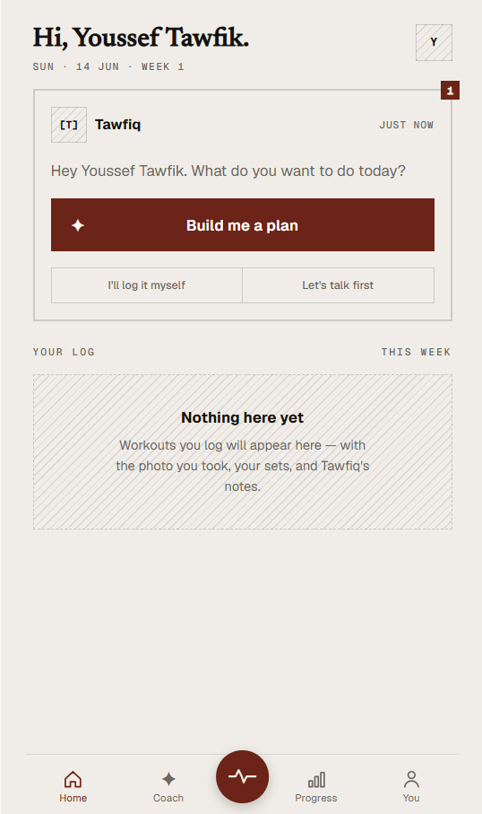
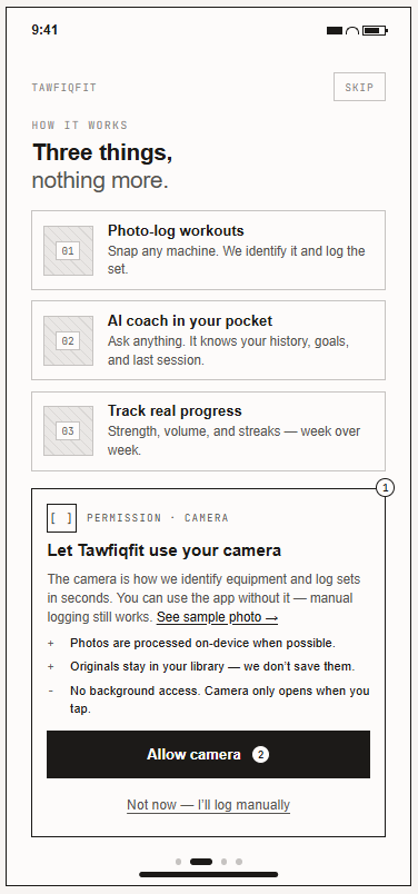
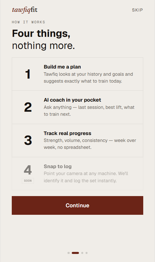
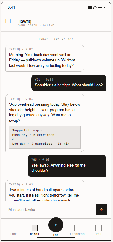
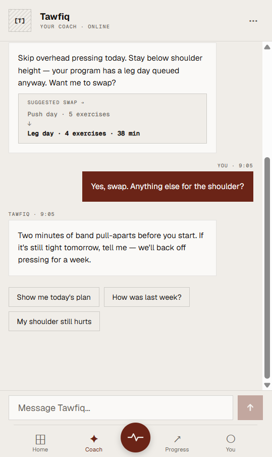
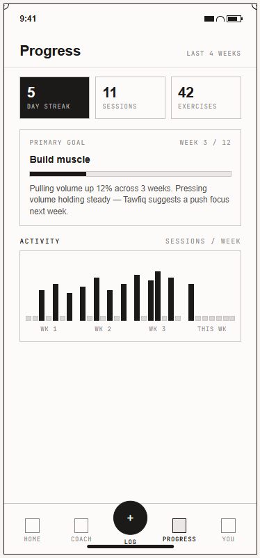
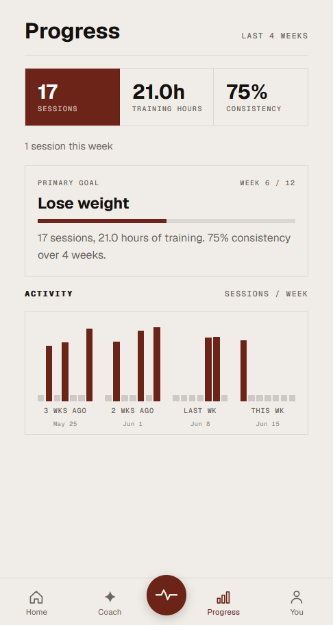
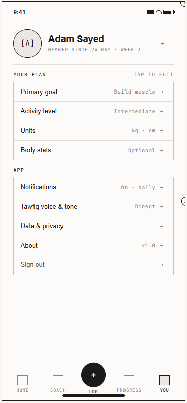
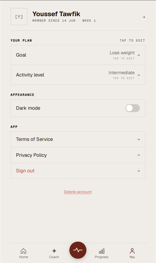
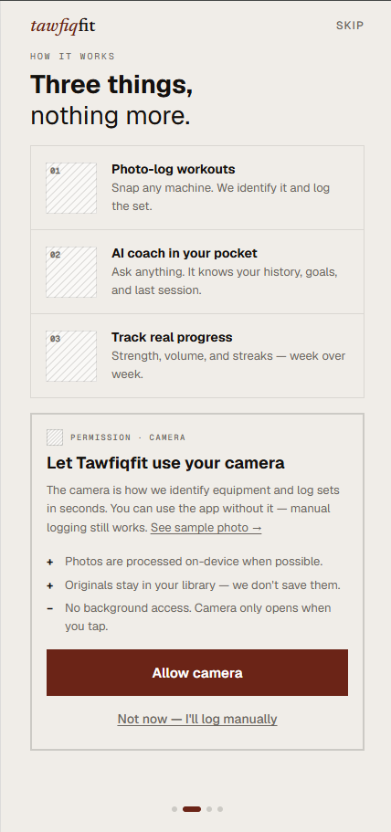
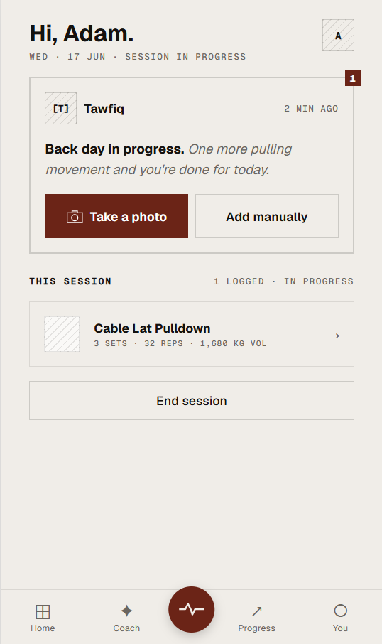
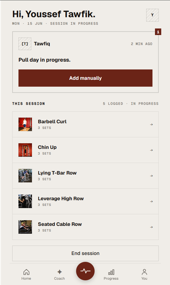
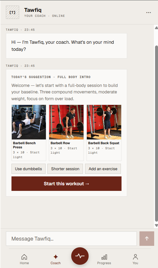
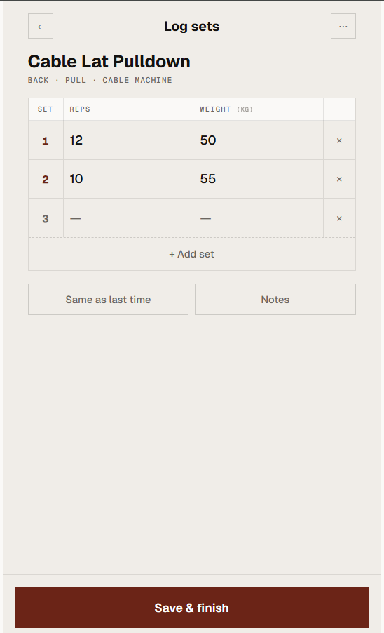
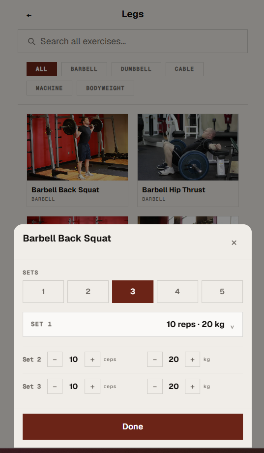
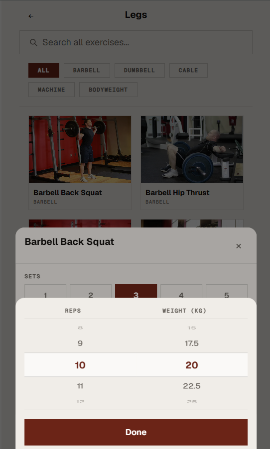
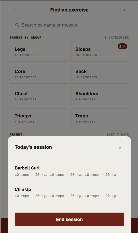
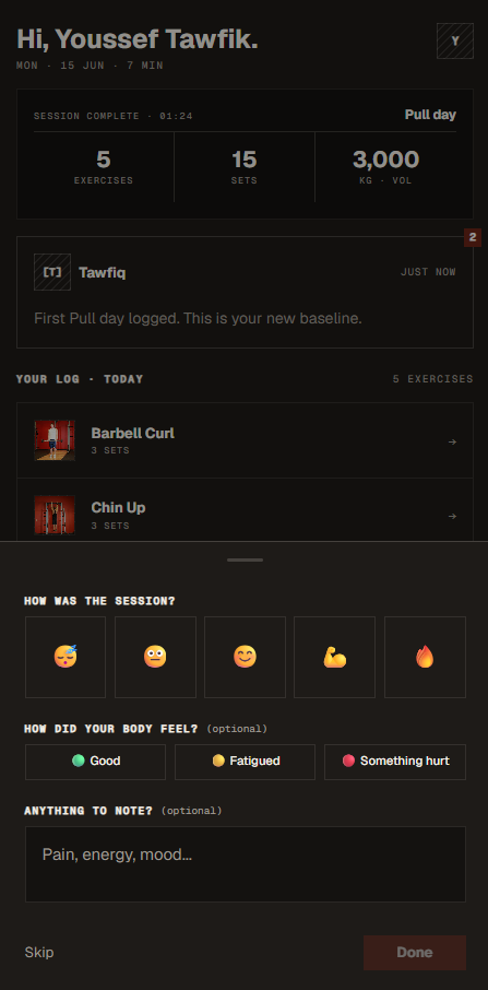
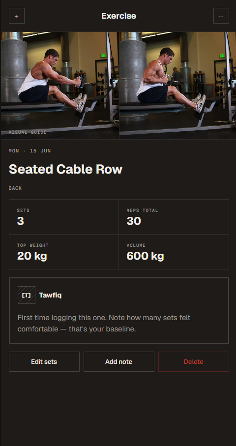
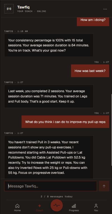
A personal fitness PWA where an AI coach named Tawfiq learns your workout history, builds your next workout from a deterministic algorithm, and coaches you through chat — grounded in your actual training data, not generic advice.
PWA
AI Coach
Algorithm-Driven Suggestions
Personalised Fitness
Try the live app →
Live beta ending July 10