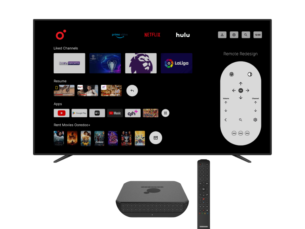
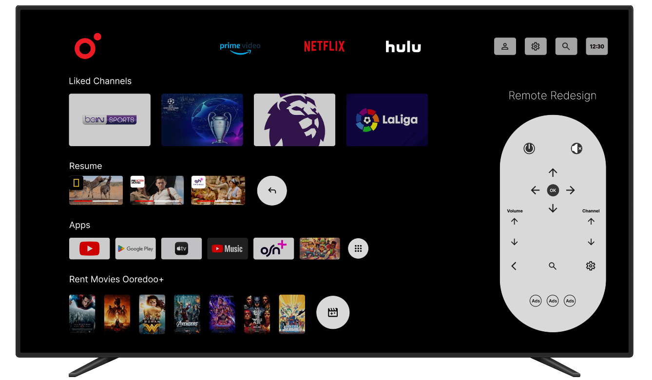
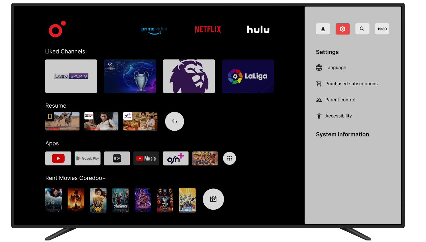
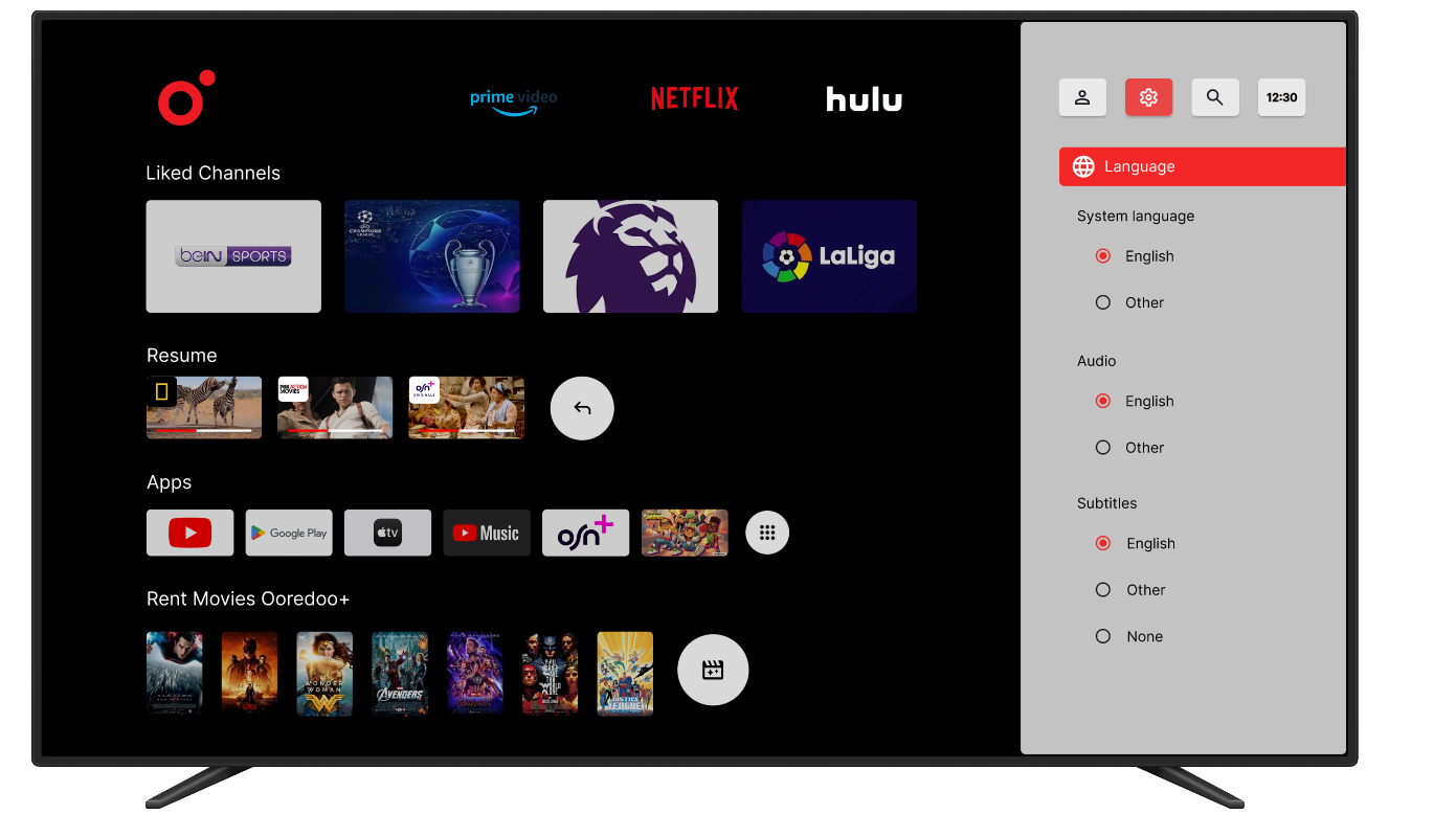
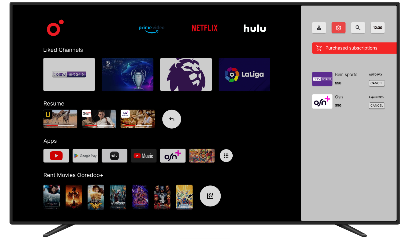
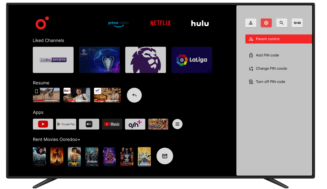
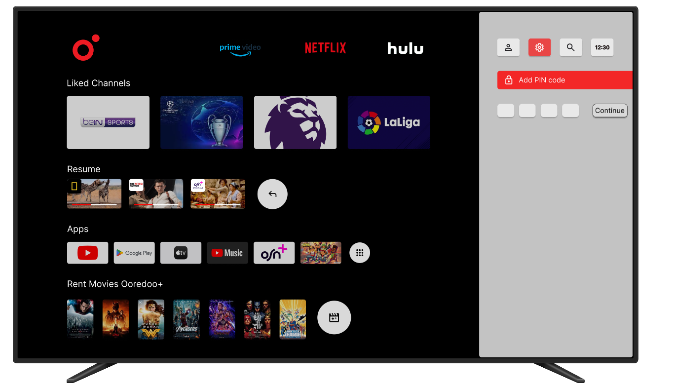
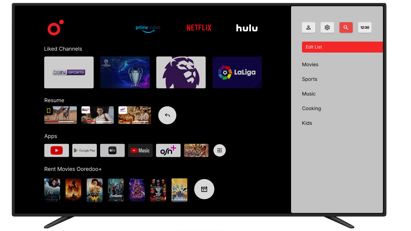
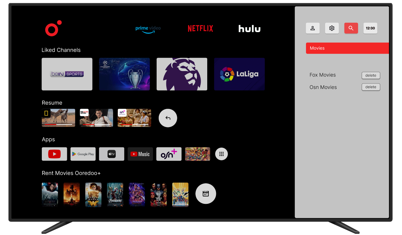
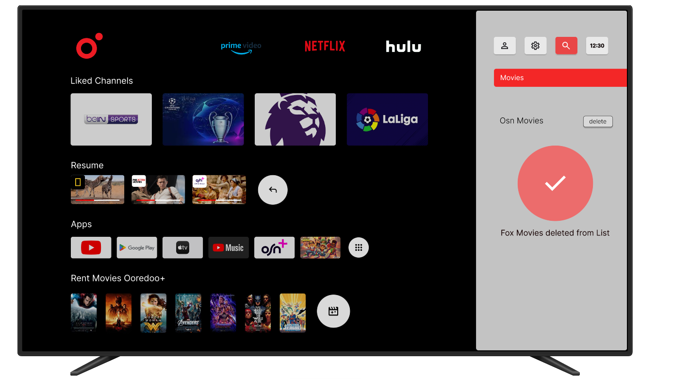
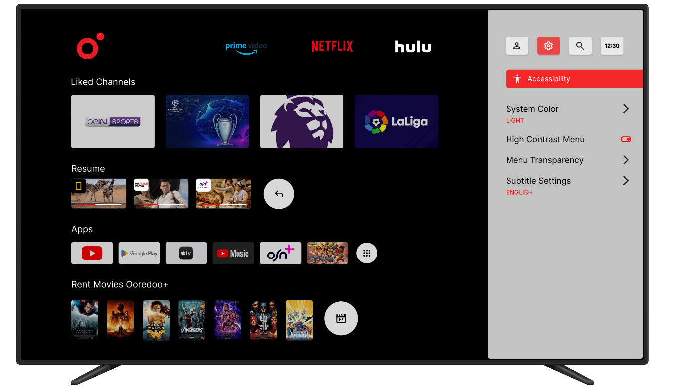
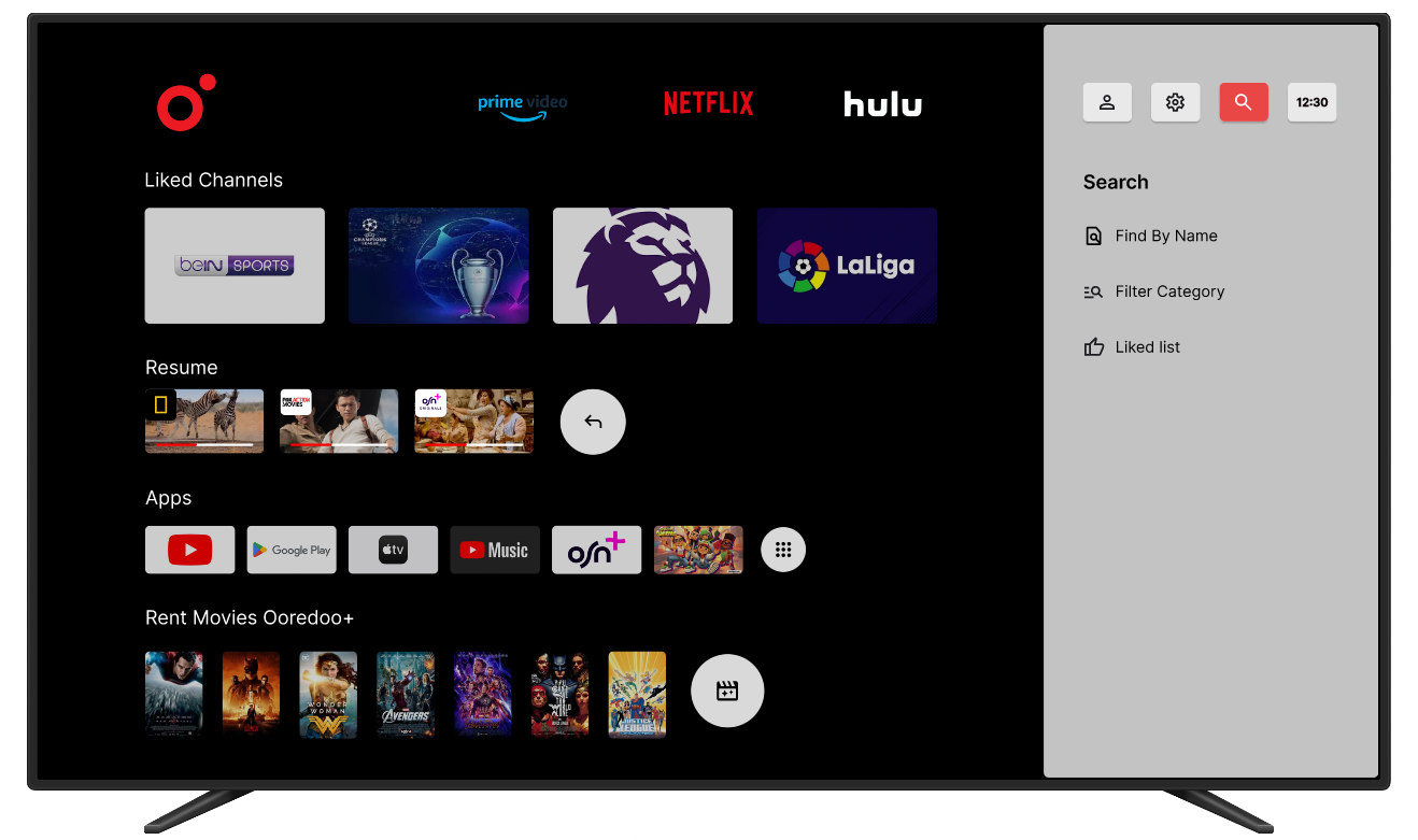
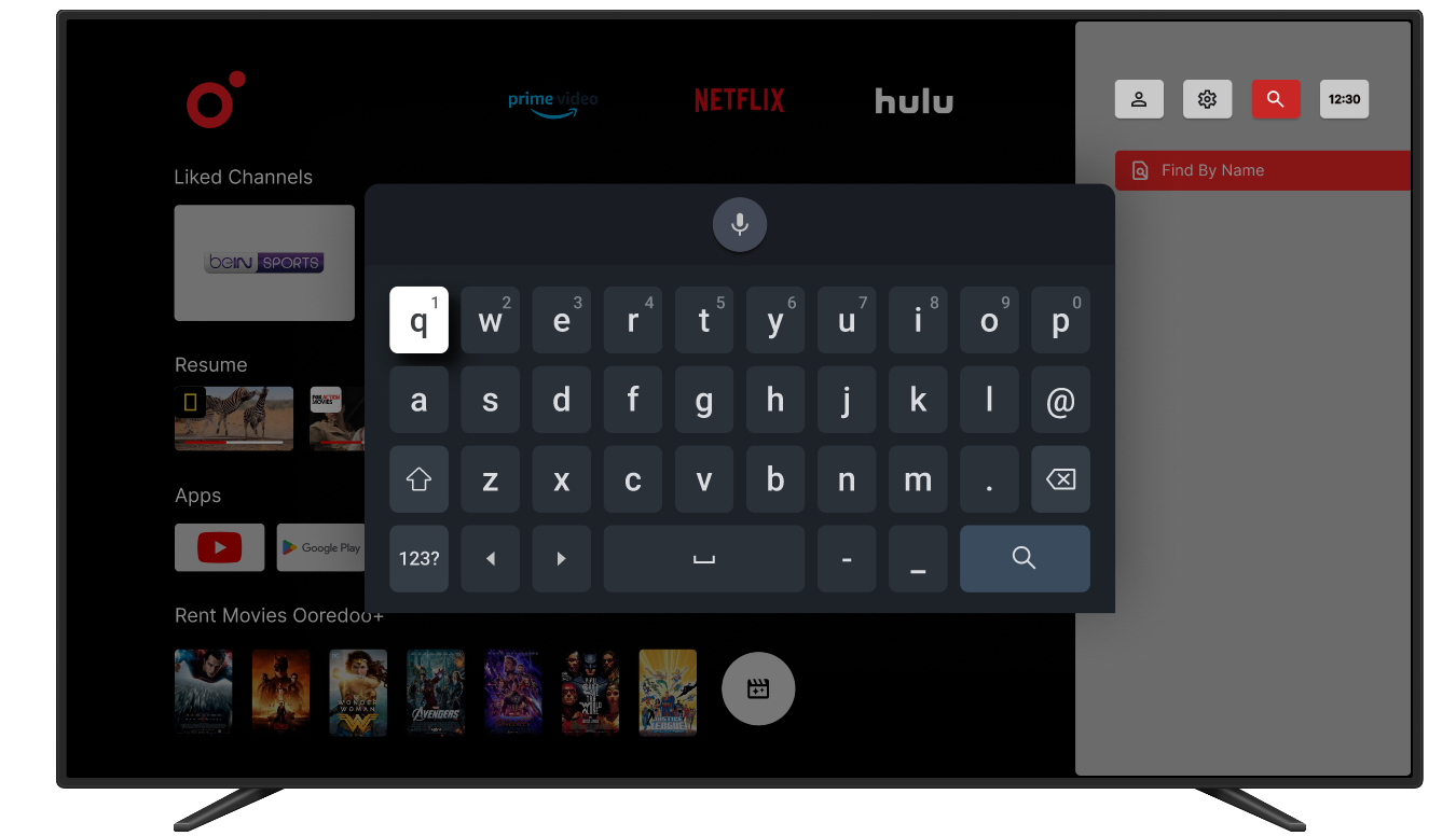
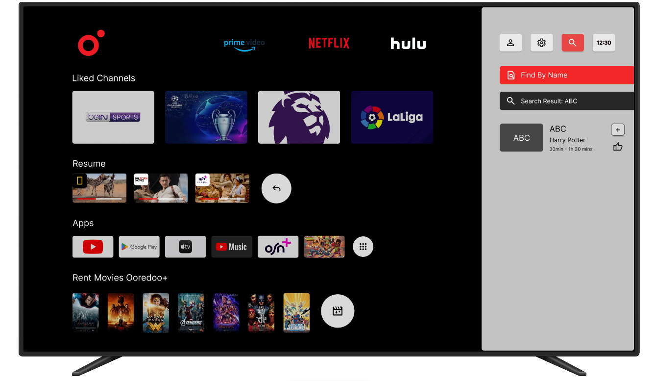
Enhancing the user experience for smart TV navigation - A comprehensive redesign focused on usability and accessibility
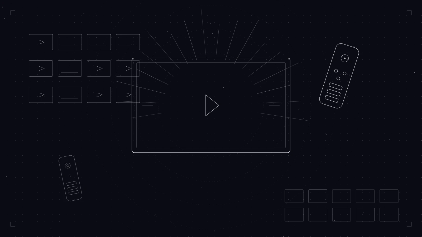
Lead UX Researcher & UI Designer
Android TV (10-foot UI)
Figma, Microsoft Teams
Heuristic Evaluation, Task Flow Analysis, Competitor Analysis, Persona Development, Iterative Prototyping
The project focuses on enhancing the user experience of the Ooredoo Android TV Box. This device transforms a regular TV into a smart TV, enabling users to surf the web, search for TV channels, buy movies, and access various streaming services. Despite its potential, the existing user interface and navigation posed significant challenges, especially for older users. This study aims to redesign the system to improve usability and satisfaction.
Understand user issues through comprehensive research
Create an intuitive interface optimized for TV screens
Ensure the interface follows Android TV guidelines
Identify user needs, pain points, and preferences
Continuously test and refine the design based on user feedback
Strengths:
Weakness:
High price point
Strengths:
Weakness:
Limited to Apple ecosystem
Strengths:
Weakness:
Limited to 1080p resolution
Enjoy customizing their interface and exploring new features. They value control and personalization.
Prefer straightforward navigation and clear instructions. They need intuitive, accessible interfaces.
Require user-friendly controls and accessible content for all ages. Safety and ease of use are priorities.
To identify usability issues and understand the current system functionality, I conducted task analysis focused on core areas:
Tested various methods of searching for channels to evaluate usability and identified possible barriers.
Analyzed points where the interface creates friction and examined restrictions of existing search methods.
Tested the effectiveness of voice commands for system navigation and evaluated command accuracy.
Assessed whether content displayed during searches meets user needs and is helpful.
Determined if information in the menu UI is relevant and helpful for users.
Measured the number of clicks required for users to complete their tasks.
Analyzed if the remote control meets user needs or requires a redesign.
Verified if information provided via voice commands is accurate and useful.
โ (โก) Button Shortcut
Pressing this button twice effectively helps users locate desired content.
โ Search Feature Issues
The menu's search function often frustrates users due to excessive clicks, causing confusion and delays in finding specific channels.
โจ Positive Aspects
The menu offers helpful options like "Future Programs," "Catch Up," and "Recent Events," giving users more control over their content selection.
Home Menu Structure: Contains sections such as "For You," "Apps," "Resume," "Movies," "Live TV," "Catch Up," and "4K Content."
Challenges:
Positive Aspects:
โ Capabilities:
โ Limitations:
โ Quick Access to Apps
The remote's app shortcut feature is time-saving for users.
๐ Potential Redesign
Navigation issues with voice commands and certain app back-navigation indicate areas where the remote's functionality could be improved.
After Research
Defined after completing heuristic evaluation โ not before. The research shaped what the real problems were.
"Ooredoo TV users โ especially older adults and families โ consistently fail to find content efficiently because the navigation architecture is inconsistent, search requires too many steps, and recommendations don't reflect actual viewing habits. The result: users give up browsing and settle for whatever is already on screen."
Pain Point 1
The back-button behaves inconsistently across apps โ once inside certain content, there's no reliable path back without restarting from the home screen entirely.
Pain Point 2
Finding a specific channel through search meant multiple menus and an on-screen keyboard navigated by D-pad โ enough friction that most users skipped it and scrolled channels manually instead.
Pain Point 3
The "For You" recommendations surface content that doesn't reflect actual viewing habits โ once trust is lost, every session becomes a manual hunt from scratch with no shortcut.
Design Accountability
Each design decision maps directly to a heuristic failure identified in the original interface. Here's what broke and what I built to fix it.
Heuristic Failure
The back-button behaves inconsistently across apps โ once inside certain content, there's no reliable way back. Users lose their place with no recovery path short of returning to the home screen.
Design Response
Introduced a persistent navigation rail visible across all screens, with a consistent home anchor. Back-button behaviour standardised within the redesigned interface โ giving users a reliable exit path wherever they are in the launcher.
Usability Principle
Nielsen heuristic #3 โ users need clearly marked "emergency exits" to leave unwanted states without going through extended dialogues.
Heuristic Failure
Finding a specific channel required: open menu โ navigate to search โ use an on-screen keyboard with a D-pad โ scroll results. Each step is a friction point until the user gives up and scrolls channels manually.
Design Response
Surfaced search directly on the home screen โ accessible in one button press. Redesigned the on-screen keyboard layout for D-pad navigation to significantly reduce input friction.
Usability Principle
Nielsen heuristic #7 โ accelerators let experienced users find content faster, while remaining accessible to novice users who discover them naturally.
Heuristic Failure
The "For You" section surfaces content that doesn't reflect actual viewing habits. Once a user distrusts it, the home screen becomes useless โ every session starts from scratch with no shortcut.
Design Response
Replaced the generic recommendation row with a user-curated Favourites section and a transparent channel list showing exactly what's included in the subscription โ building trust from the first screen.
Usability Principle
Nielsen heuristic #2 โ the system should speak the user's language, showing content they recognise and chose, not recommendations they can't explain.
Identified Beyond the Brief
Several buttons had unclear functions with no labels. There was no dedicated search button โ forcing users through menu navigation to reach the most important feature. A UI-only fix couldn't fully solve this.
Design Response
Proposed and designed a revised remote with a dedicated search button and clearer button grouping โ not part of the original brief, but identified as essential for the experience to work end-to-end.
Usability Principle
Nielsen heuristic #6 โ users shouldn't have to remember what unlabelled buttons do. Visible, labelled controls reduce cognitive load and make the physical interaction self-explanatory.
See the solutions in action
Every design decision above is reflected in the interactive Figma prototype
View Interactive Prototype โConsolidate all menu options on the right side to align with right-to-left language preferences.
Introduce a dedicated search button on the remote for quick access.
Allow users to add channels to a favorites list easily.
Provide clear information on subscription status and renewal options.
Improve the algorithm to better reflect user preferences.
Below are the final high-fidelity designs showcasing the redesigned interface, improved navigation, and enhanced user experience.
The redesign can improve user satisfaction by simplifying navigation and enhancing the search function
Evaluation findings are essential in iterative design to identify and resolve usability issues
Continuous testing is needed to maintain a high standard of user experience
Designing for accessibility ensures the interface works for all user groups, including older adults
Expanding user testing to a more diverse group to ensure inclusivity
Regular updates based on evaluation findings to maintain a high standard of user experience
Gather quantitative data from Ooredoo TV users for data-driven design decisions
Test features for kids such as gamified courses with rewards